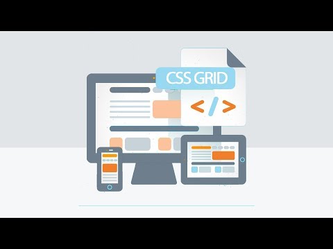
CSS Grid Layout is a two-dimensional layout system for the web. It lets you layout items in rows and columns, making it easier to design web pages without using floats and positioning.
Watch this video to learn more about CSS Grid Layout:
The presented Example of Grid Layout.
<!DOCTYPE html>
<html lang="en">
<head>
    <meta charset="UTF-8">
    <meta name="viewport" content="width=device-width, initial-scale=1.0">
    <title>CSS Grid Example</title>
    <link rel="stylesheet" href="styles.css">
</head>
<body>
    <div class="grid-container">
        <div class="grid-item">1</div>
        <div class="grid-item">2</div>
        <div class="grid-item">3</div>
        <div class="grid-item">4</div>
        <div class="grid-item">5</div>
        <div class="grid-item">6</div>
    </div>
</body>
</html>.grid-container {
display: grid;
grid-template-columns: repeat(3, 1fr);
gap: 10px;
}
.grid-item {
background-color: #8ca0ff;
border: 1px solid #000;
padding: 20px;
text-align: center;
}
- grid-template-columns: Defines the number of columns in the grid and their width.
repeat(3, 1fr)creates three columns of equal width. - gap: Sets the spacing between grid items.
- grid-item: Styles for individual grid items.

- grid-cloumn:[start]/[end]: Specifies the start and end positions of the grid item.
- grid-row:[start]/[end]: Specifies the start and end positions of the grid item.
- Example:
grid-column: 1 / 3;will span the grid item from the first to the third column as shown in the image "the green example".

Check the Example of Grid Areas.
You can define grid areas using the grid-template-areas property. This allows you to name areas of the grid and place items in those areas as shown below:
.grid-item1 {
    grid-area: header;
}
.grid-item2 {
    grid-area: footer;
}
CSS Grid Layout is a powerful tool for creating complex web layouts. By mastering it, you can create responsive and flexible designs with ease.
Intro Stage-6 --- Go Back --- Next