A tabbed card for Home Assistant dashboards with visual editor (add tabs with "+", choose card type), Styling CSS (no card_mod), haptic feedback (iOS/Android), URL deep-linking and swipe navigation. Fork of home-assistant-simple-tabs.
Buy me a coffee: https://buymeacoffee.com/mysmarthomeblog
Subscribe to Youtube channel: https://www.youtube.com/@My_Smart_Home
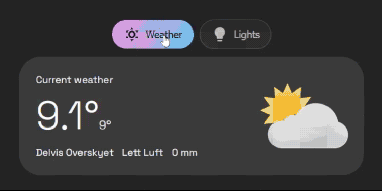
- Organize Your Dashboard: Group any Dashboard cards into a clean, tabbed interface.
- Tab Icons: Add icon to your tab titles.
- Stylable: Customize colors for the background, border, text, and active tab.
- Alignment: Align your tabs to the start, center, or end of the card.
- Tab Positioning: Choose to display tabs at the top or bottom of the card.
- Dynamic Defaults: Change the default tab automatically based on your home's state (e.g., show "Remote" tab when TV is on).
- User Privacy: Hide specific tabs from specific users (e.g., hide admin controls from guests).
- Conditional Tabs: Dynamically show or hide tabs based on entity states or complex jinja templates.
- Performance: Use the default "lazy-loading" for the best performance, or enable "pre-loading" for instantaneous tab switching.
- Mobile-Optimized: Swipe between tabs with gesture support that intelligently avoids conflicts with sliders.
- Tab Memory: Optionally remember your last selected tab across sessions (per-device or global).
- Haptic Feedback: Optional vibration feedback on tab changes for mobile devices.
- Go to the HACS page in your Home Assistant instance.
- Click the three-dot menu in the top right.
- Select "Custom repositories".
- In the "Repository" field, paste:
https://github.com/silasmariusz/home-assistant-simple-tabs - For "Category", select Frontend (or Dashboard).
- Click "Add".
- Find Fork U-Bubble Simple Tabs in the Frontend list and click "Install".
- Download
fork_u-bubble_simple_tabs.jsfrom the latest release. - Copy it to the
wwwdirectory in your Home Assistantconfigfolder. - In Lovelace, go to "Manage Resources" and add:
- URL:
/local/fork_u-bubble_simple_tabs.js(or/hacsfiles/fork_u-bubble_simple_tabs/fork_u-bubble_simple_tabs.jsif installed via HACS) - Resource Type:
JavaScript Module
- URL:
You can now add multiple cards to a single tab without needing to manually wrap them in a vertical-stack.
- Click the
+ Add Another Cardbutton at the bottom of any tab editor - The tab will automatically convert to multi-card mode
- You can add as many cards as you like, each with its own YAML editor
Instead of card, use cards (plural) which takes a list of card configurations:
tabs:
  - title: Living Room
    icon: mdi:sofa
    cards:
      - type: entity
        entity: light.living_room
      - type: thermostat
        entity: climate.living_room
The card will automatically handle wrapping them in a vertical stack for you.
| Name | Type | Required? | Description | Default |
|---|---|---|---|---|
type |
string | Required | custom:fork-u-bubble-simple-tabs |
|
tabs |
list | Required | A list of tab objects to display. See below. | |
alignment |
string | Optional | Justification for the row of tabs. (start, center, end) |
'center' |
default_tab |
number/list | Optional | Defines the default tab. Can be a static number (1-based) or a list of conditional rules (see Advanced Configuration). | 1 |
hide_inactive_tab_titles |
boolean | Optional | If true, hides the title text on tabs that are not currently active (showing only the icon). |
false |
pre-load |
boolean | Optional | If true, renders all tab content on load for faster switching. |
false |
background-color |
string | Optional | CSS color for the button background. | none |
border-color |
string | Optional | CSS color for the button border. | Your theme's divider-color |
text-color |
string | Optional | CSS color for the button text. | Your theme's secondary-text-color |
hover-color |
string | Optional | CSS color for button text and border on hover. | Your theme's primary-text-color |
active-text-color |
string | Optional | CSS color for the active tab's text. | Your theme's text-primary-color |
active-background |
string | Optional | CSS color/gradient for the active tab's background. | Your theme's primary-color |
container_background |
string | Optional | CSS color/gradient for the background color of the container. | none |
container_padding |
string | Optional | Container padding | 12px |
container_rounding |
string | Optional | Border radius of the container | 32px |
tabs_gap |
string | Optional | Gap between buttons | 6px |
button_padding |
string | Optional | Padding inside each button | 12px |
tab_position |
string | Optional | Position of tabs. (top, bottom) |
'top' |
enable_swipe |
boolean | Optional | Enable swipe gestures to switch tabs on mobile. | true |
swipe_threshold |
number | Optional | Pixels of movement required to trigger a swipe. | 50 |
remember_tab |
boolean/string | Optional | Remember last selected tab. (false, true, 'per_device') |
false |
haptic_feedback |
boolean | Optional | Vibration feedback on tab change (mobile only). | false |
styling_css |
string | Optional | Custom CSS for the card container (no card_mod needed). |
Each entry in the tabs list is an object with the following properties:
| Name | Type | Required? | Description |
|---|---|---|---|
title |
string | Optional* | The text to display on the tab. Can be jinja template |
icon |
string | Optional* | An MDI icon to display next to the title (e.g., mdi:lightbulb). Can be jinja template |
card |
object | Required | A standard Lovelace card configuration. |
conditions |
list | Optional | A list of conditions (entity, template, or user) that must be met to show the tab. |
badge |
string | Optional* | Jinja template that outputs true/false |
id |
string | Optional | ID of tab, for deeplinking |
*Either title or icon has to be defined.
Instead of a static number, default_tab can be a list of rules. The card will check them from top to bottom and select the first one that matches.
Note: It is recommended to use entity state checks here rather than template for faster initial loading.
default_tab:
  # 1. If TV is on, open Tab 2 (Controls)
  - tab: 2
    conditions:
      - entity: media_player.tv
        state: 'on'
  # 2. If it is night time, open Tab 3 (Bedroom)
  - tab: 3
    conditions:
      - entity: sun.sun
        state: 'below_horizon'
  # 3. Fallback to Tab 1
- tab: 1You can hide specific tabs from specific users by adding a user condition. You will need the long User ID string (found in HA Settings -> People -> Users -> Click User -> ID at bottom).
tabs:
  - title: Admin Controls
    icon: mdi:shield-account
    conditions:
      - user:
          - "8234982374982374982374"  # Dad
          - "1928371928371928371928"  # Mom
    card:
# ...This configuration demonstrates dynamic defaults, user restrictions, and the compact "hide inactive titles" style.
type: custom:fork-u-bubble-simple-tabs
alignment: start
hide_inactive_tab_titles: true
default_tab:
  - tab: 2
    conditions:
      - entity: light.kitchen_lights
        state: 'on'
  - tab: 1
tabs:
  - title: Livingroom
    icon: mdi:sofa
    card:
      type: markdown
      content: Livingroom goes here
  - title: Kitchen
    icon: mdi:silverware-fork-knife
    card:
      type: markdown
      content: Kitchen goes here
  - title: Admin
    icon: mdi:cog
    conditions:
      - user: "YOUR_ADMIN_ID_HERE"
    card:
      type: markdown
content: Sensitive admin controls...- Visual Configuration Editor: ✅ Basic UI editor available. Continuing to develop a more robust UI editor.
- More styling options: ✅ Extensive styling options available. Continue adding more as requested.
- Tab positioning: ✅ Completed - tabs can now be positioned at top or bottom.
- Touch navigation: ✅ Completed - swipe gestures with smart conflict detection.
- Tab memory: ✅ Completed - persistent tab selection with priority logic.
- Haptic feedback: ✅ Completed - optional vibration on tab changes.
- Animations: Add smooth transitions when switching between tabs.
- URL support: ✅ Partially completed - tabs linkable via deep links (##tab-id). Full URL routing in progress.